Anime

What Makes SHAFT Animation Special

What Makes SHAFT Animation Special

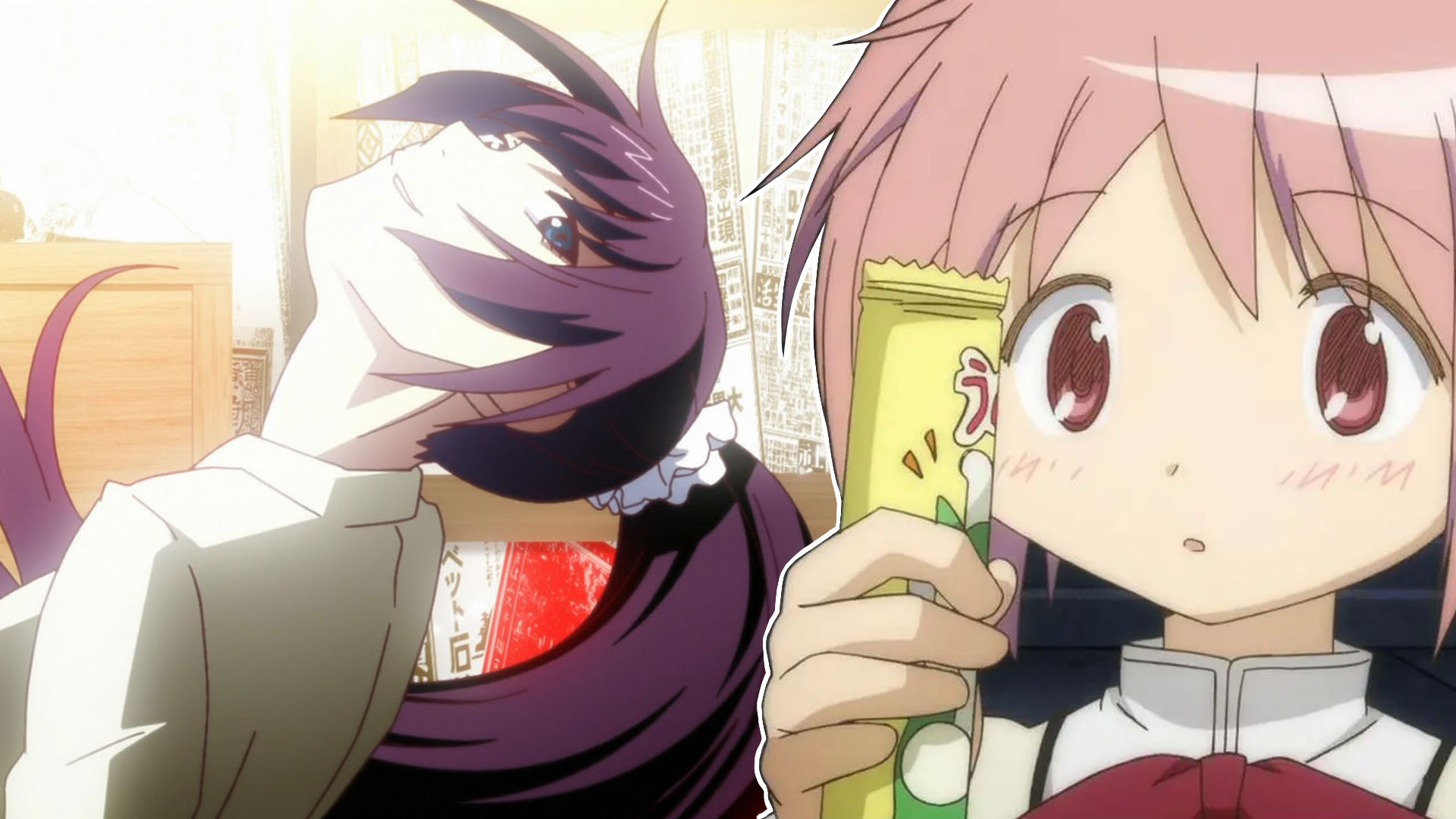
No, it's not just a head tilt.

Some animation studios have such distinct artistic styles that you can recognize them by a single frame. One of such studios is SHAFT. On the one hand, having an easily recognizable style is good: the creative vision is solid, and the viewer knows what to expect from the studio's work. But there's a second side to it: some believe that it leads to repetitiveness, lack of creativity, and sameness. Yet it wasn't like that all the time.

SHAFT was created in 1975 by Wakao Hiroshi, who previously worked at the studio Mushi Production. In its earlier years SHAFT was helping other studios with sub-contracting work — they did cel paintings, color coordination, and backgrounds. Their first fully original work was released in 1984 — it was Yume kara, Samenai OVA.

After releasing one more OVA the studio returned to subcontracting, but focused more on the animating part instead of the drawing one. This type of work allowed the studio to become quite well-known in the industry and create a lot of useful connections. That brought more outsourced work, and more visibility, allowing the studio to expand and move into full production.

But the SHAFT as we are most familiar with was conceived in 2004, when Kubota Mitsutoshi replaced the studio's founder as head of this studio and together with the director Shinbo Akiyuki, decided to make SHAFT unique by developing their own signature style.

Shinbo had a fruitful career in the industry even before SHAFT, mostly known for directing episodes of Yu Yu Hakusho, especially the ones covering the Dark Tournament arc. His stylistic choices seen in those episodes — bold palette, color blocking, impressive compositions, and inventive viewing angles — are the ones that migrated to the modern SHAFT's signature style.

These stylistic choices are dictated by Shinbo's relationship with realism. He believes that things shouldn't be true to life, but need to feel like a statement, perfectly conveying the idea through the combination of shapes, lighting, colors, and specific framing. He tries not to paint the picture, but the feeling, to make the shots more expressive and vivid. His frames scream at the viewer through their composition and bold colors, not really following the path of narrative visual storytelling.
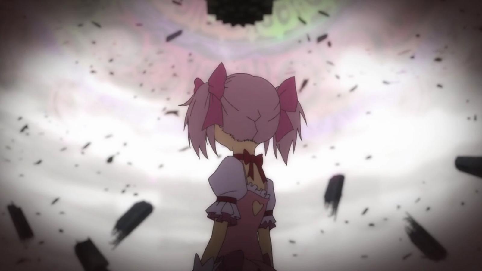
 - image 1

Creating a signature style would not only make the studio SHAFT stand out from the myriad of others, but it would also make the production pipeline more effective and less time-consuming. Alongside Shinbo, two of his long-time friends, Oishi Tatsuya and Oonuma Shin, formed the "Team Shinbo" which was tasked with developing the special style and refining the production.

These striking, loud visuals, full of geometry, weird parallax effects, unrealistic scaling, and distinct framing, were conscious choices. But Shinbo himself doesn't do any animating in the SHAFT, he's taken a role of a consultant and supervisor making sure that the works are oozing "shaftness".
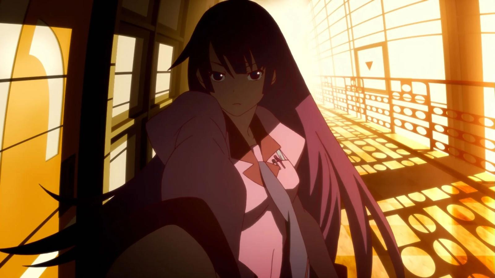
 - image 2

Oonuma is mostly known for his unique framing and visual composition, one that is quite distinct in the ef: A Tale of Memories and the Monogatari series. He masterfully plays with scale, creating a unique sense of grandness that represents the heaviness of the climactic moments and their importance to the story.

Right now he doesn't work for SHAFT, but his legacy stays. Omata Shinichi, another notable artist, is more known for his use of unusual viewing angles, favoring the bird-eye, with distinct composition choices. He also left the studio, but contributed to its style heavily.

The existence of the specific style, however, doesn't mean the actual sameness. That could be proven by the Monogatari series where you can see different approaches to the direction portrayed in the Kizumonogatari movie and the TV animation seasons. The movie was directed by one of the members of "Team Shinbo", Oishi Tatsuya, while the TV animation was directed by Itamura Tomoyuki.

Both followed the guidelines with bold colors, a minimalistic approach, and clean geometric shapes, but their personal vision affected the production quite seriously. Despite being undoubtedly SHAFT and also belonging to the same franchise, both these works cannot be accused of lazy repetitiveness. Sure, the TV series' minimalism in terms of animation is partially provoked by the tight scheduling, but that's not the only difference in their approaches.
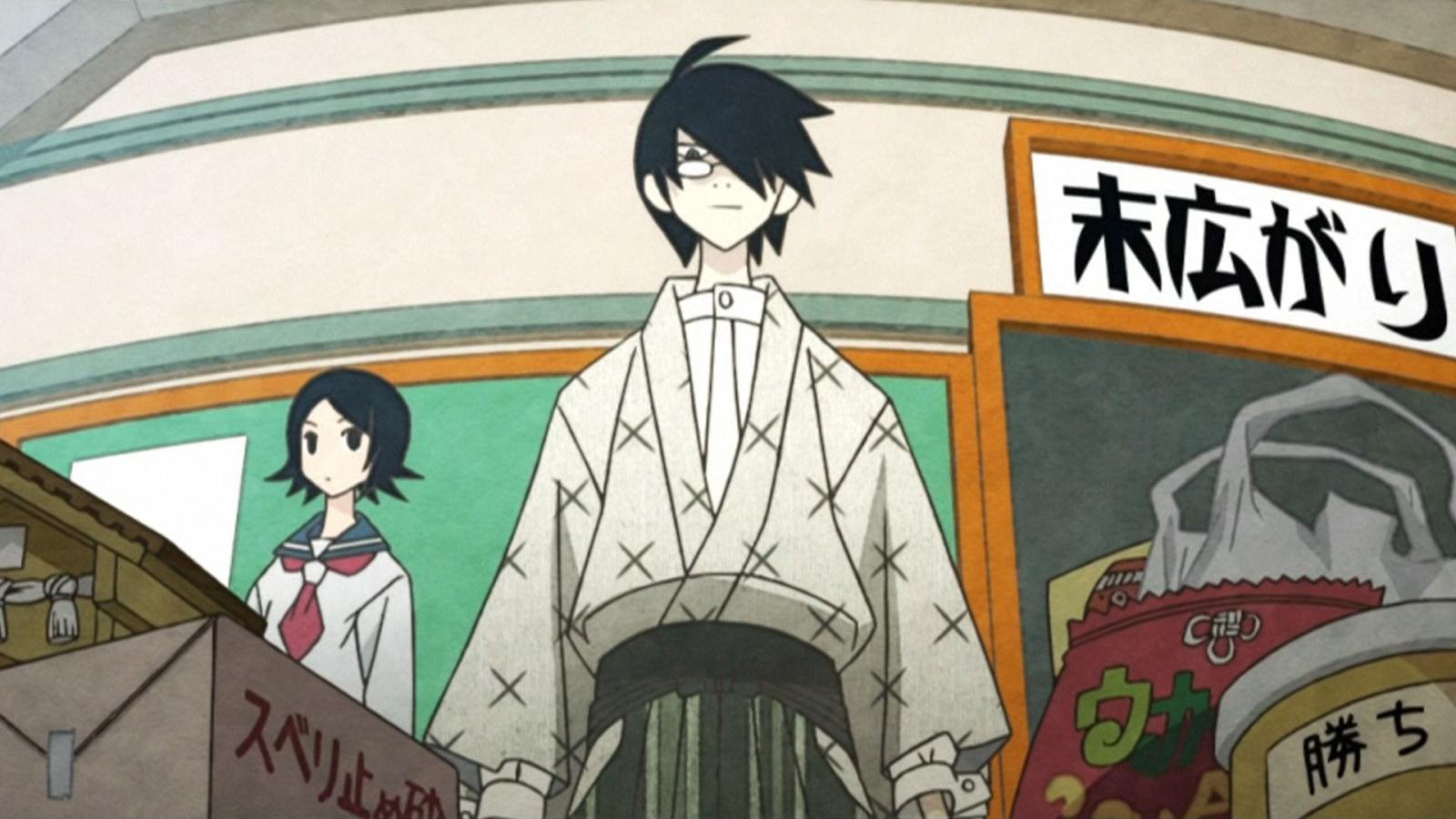
 - image 3

The SHAFT signature style is not a strict set of rules; it's a general vibe that people with their own creative vision should base their choices upon. Individual creators still contribute a lot to the shows they are working on, using the signature stylistic choices only as a guide, but not as an inviolable law.

Art is always up to interpretation, and SHAFT's approach to it shows it perfectly. With a similar set of guidelines, different artists would still create different works, not copying each other. They just have a thing that they can rely on, and that saves a little bit of mental load in choosing specific framings, color palettes, or the overall mood of the scene. But that doesn't kill the art part of the show, and that is what is important.

And the head tilts. Never forget the head tilts.

No, it's not just a head tilt.

Some animation studios have such distinct artistic styles that you can recognize them by a single frame. One of such studios is SHAFT. On the one hand, having an easily recognizable style is good: the creative vision is solid, and the viewer knows what to expect from the studio's work. But there's a second side to it: some believe that it leads to repetitiveness, lack of creativity, and sameness. Yet it wasn't like that all the time.

SHAFT was created in 1975 by Wakao Hiroshi, who previously worked at the studio Mushi Production. In its earlier years SHAFT was helping other studios with sub-contracting work — they did cel paintings, color coordination, and backgrounds. Their first fully original work was released in 1984 — it was Yume kara, Samenai OVA.

After releasing one more OVA the studio returned to subcontracting, but focused more on the animating part instead of the drawing one. This type of work allowed the studio to become quite well-known in the industry and create a lot of useful connections. That brought more outsourced work, and more visibility, allowing the studio to expand and move into full production.

But the SHAFT as we are most familiar with was conceived in 2004, when Kubota Mitsutoshi replaced the studio's founder as head of this studio and together with the director Shinbo Akiyuki, decided to make SHAFT unique by developing their own signature style.

Shinbo had a fruitful career in the industry even before SHAFT, mostly known for directing episodes of Yu Yu Hakusho, especially the ones covering the Dark Tournament arc. His stylistic choices seen in those episodes — bold palette, color blocking, impressive compositions, and inventive viewing angles — are the ones that migrated to the modern SHAFT's signature style.

These stylistic choices are dictated by Shinbo's relationship with realism. He believes that things shouldn't be true to life, but need to feel like a statement, perfectly conveying the idea through the combination of shapes, lighting, colors, and specific framing. He tries not to paint the picture, but the feeling, to make the shots more expressive and vivid. His frames scream at the viewer through their composition and bold colors, not really following the path of narrative visual storytelling.

What Makes SHAFT Animation Special - image 1

Creating a signature style would not only make the studio SHAFT stand out from the myriad of others, but it would also make the production pipeline more effective and less time-consuming. Alongside Shinbo, two of his long-time friends, Oishi Tatsuya and Oonuma Shin, formed the "Team Shinbo" which was tasked with developing the special style and refining the production.

These striking, loud visuals, full of geometry, weird parallax effects, unrealistic scaling, and distinct framing, were conscious choices. But Shinbo himself doesn't do any animating in the SHAFT, he's taken a role of a consultant and supervisor making sure that the works are oozing "shaftness".

What Makes SHAFT Animation Special - image 2

Oonuma is mostly known for his unique framing and visual composition, one that is quite distinct in the ef: A Tale of Memories and the Monogatari series. He masterfully plays with scale, creating a unique sense of grandness that represents the heaviness of the climactic moments and their importance to the story.

Right now he doesn't work for SHAFT, but his legacy stays. Omata Shinichi, another notable artist, is more known for his use of unusual viewing angles, favoring the bird-eye, with distinct composition choices. He also left the studio, but contributed to its style heavily.

The existence of the specific style, however, doesn't mean the actual sameness. That could be proven by the Monogatari series where you can see different approaches to the direction portrayed in the Kizumonogatari movie and the TV animation seasons. The movie was directed by one of the members of "Team Shinbo", Oishi Tatsuya, while the TV animation was directed by Itamura Tomoyuki.

Both followed the guidelines with bold colors, a minimalistic approach, and clean geometric shapes, but their personal vision affected the production quite seriously. Despite being undoubtedly SHAFT and also belonging to the same franchise, both these works cannot be accused of lazy repetitiveness. Sure, the TV series' minimalism in terms of animation is partially provoked by the tight scheduling, but that's not the only difference in their approaches.

What Makes SHAFT Animation Special - image 3

The SHAFT signature style is not a strict set of rules; it's a general vibe that people with their own creative vision should base their choices upon. Individual creators still contribute a lot to the shows they are working on, using the signature stylistic choices only as a guide, but not as an inviolable law.

Art is always up to interpretation, and SHAFT's approach to it shows it perfectly. With a similar set of guidelines, different artists would still create different works, not copying each other. They just have a thing that they can rely on, and that saves a little bit of mental load in choosing specific framings, color palettes, or the overall mood of the scene. But that doesn't kill the art part of the show, and that is what is important.

And the head tilts. Never forget the head tilts.