Anime

How Monogatari Series Translates Light Novel Specifics Into Anime So Well

How Monogatari Series Translates Light Novel Specifics Into Anime So Well

Use more letters.

A lot of anime are adaptations of light novels or manga. Usually, they just translate the story by using a narrator's voice for the inner monologues, and for some stories, it's enough to keep the viewer immersed in the protagonist's head. But sometimes the animation studios go further.

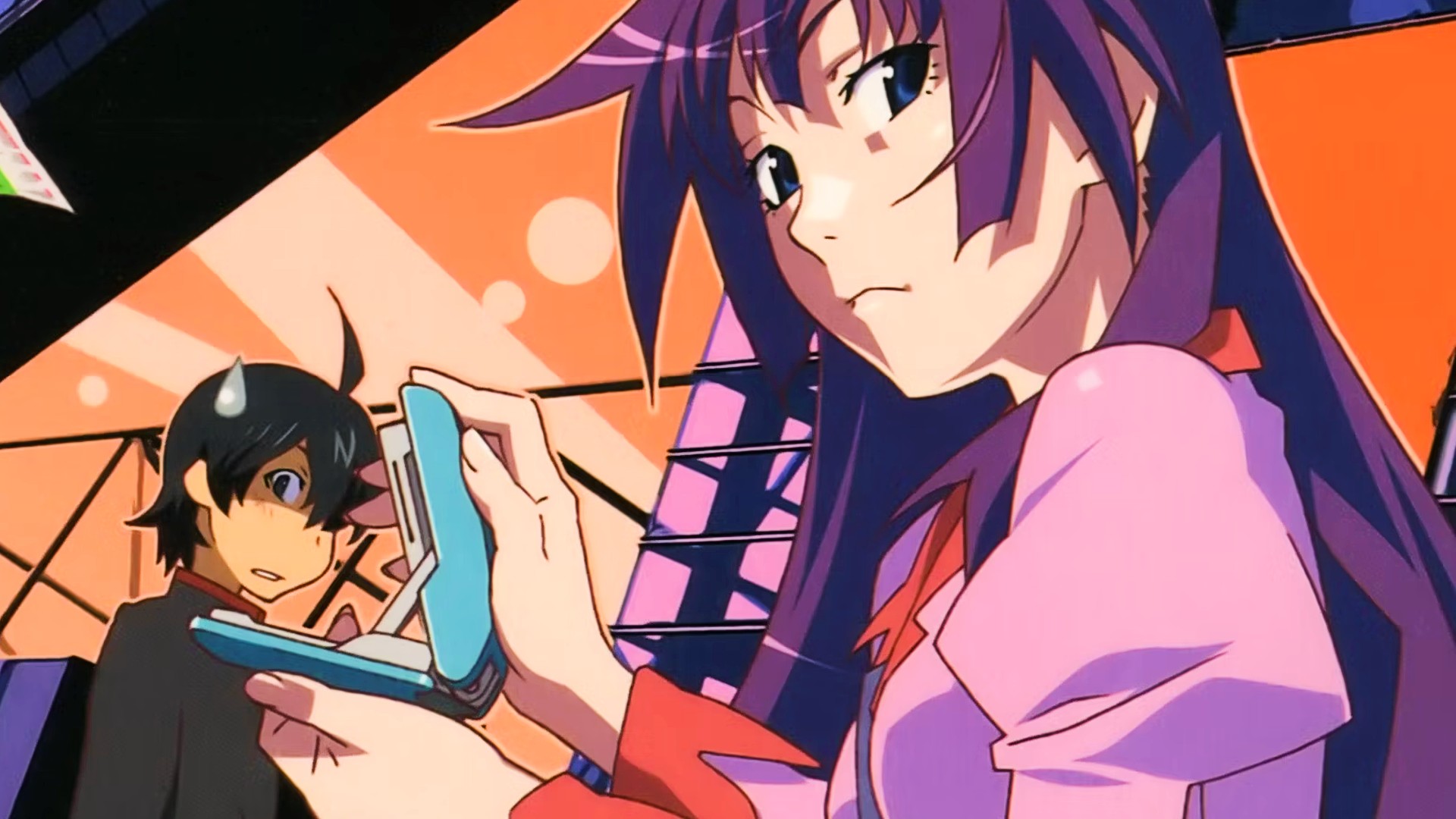
Enter SHAFT and their adaptation of the Monogatari series, light novels by Nisio Isin. The visual language of SHAFT is married to the bizarre and abstract nature of the novels, their unreliability and sophistication.

Nisio Isin's series quickly became a classic in the light novel world, surreal and filled with a lot of remarks and fourth wall breaks alongside allusions to the other media and important parts of Japanese culture.

The way Nisio Isin writes the novels is complicated, non-linear, his texts sometimes lulling the reader into a false sense of security with long descriptions of some mundane things and then throwing at them a bucket of cold water on the next page. It's a whiplash. And SHAFT's visual language also tries to achieve this effect — with bold colors, creative framing, unusual angles.

We talked in-depth about how SHAFT developed and then honed their unique style, and there is one thing that is prevalent in their works — one that be seen not only in the Monogatari series, but also in the Sayonara, Zetsubou-Sensei, and in some other works, although not as often.

It's the usage of frames filled with words. Just a huge color-blocked panel with some words written on it, in various ways. In the Monogatari series, these panels with words are sometimes used to show the inner monologue of the main character while the actual voice acting is engaged in a dialogue.

Sometimes these panels just add extra context to the inner monologue. Sometimes they create exposition. Sometimes they confuse you. Sometimes there's so much text that people who were watching the original release on a TV were forced to buy the BD version of the show just so they could pause this frame and read it.

And the usage of text helped marry the anime series with a light novel medium. The way these text frames are playing with the viewer is very similar to how actual Nisio Isin's novels play with the reader. And that was an incredibly smart move — one that fits the style that SHAFT crafted for themselves.